Matplotlib’s settings for axis are numerous and confusing. You are probably confused about ticks, scales, and limit settings.
This article details how to customize axis in Matplotlib. Specific steps are presented to set up tick marks, change the scale, and control the range of the axis.
After reading the article, you will be able to freely set the axes of your graphs using Matplotlib. This will allow you to visualize your data even more effectively.
Please refer to the following article for a beginner’s tutorial

Components of a Figure
The components of a figure in Matplotlib is shown in the figure below. There are four major components, Figure, Axes, Axis, and Artist, but they are a little complicated because they contain each other.
In this article, we will focus on Axes and Axis in particular.
Components of a Figure
- The whole figure (Figure)
-
All child Axes, titles, figure legends, color bars, etc. are supported.
Although it is convenient to write the graph in combination with Axes, it is also possible to draw the graph with Figure alone.
- A region for plotting data (Axes)
-
Artist in the Figure that contains the plot area of the data.
It usually contains two (three in the case of 3D)
Axisobjects (note the difference betweenAxesandAxis) and provides tick and tick labels in the Axes. Each Axes also has a title, x label, and y label. - Figure Axis Setting (Axis)
-
Objects related to the axes of the figure.
Sets the scale and limits, and generates ticks and tick labels. The position of the scale is determined by the
Locatorobject and the string of the scale label is formatted by theFormatter. - All elements in the figure (Artist)
-
Basically, anything visible on a Figure is an Artist (including
Figure,AxesandAxisobjects).When Figure is invoked, all Artists are drawn.

Axis label (Axes.set_xlabel, set_ylabel)
Axis labels can be set with Axes.set_xlabel and Axes.set_ylabel
ax.set_xlabel('X Label'), ax.set_ylabel('Y Label')
- Parameters
- Official Documentation
The following tabs explain with codes and flowcharts.
# step0 Import libraries
import matplotlib.pyplot as plt
import numpy as np

# step1 Create data
x = np.linspace(0, 10, 100)
y1 = 4 + 2 * np.sin(2 * x)
y2 = 4 + 2 * np.cos(2 * x)

# step2 Create graph frames
fig, ax = plt.subplots(figsize=(6, 4))

# step3 Plot graphs
ax.plot(x, y1, 'o--')
ax.plot(x, y2, 'D--')

# step4 Set Axis
# Set axis labels
ax.set_xlabel('X Label')
ax.set_ylabel('Y Label')

ax.set_title('Label')

# step5 Call the Figure
plt.show()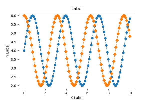
Space from axis label (labelpad)
Spacing in points from the Axes bounding box including ticks and tick labels.
If None, the previous value is left as is.
Specified by float value, default is 4.
# step4 Set Axis
# Set axis labels
ax.set_xlabel('X Label', labelpad=-10)
ax.set_ylabel('Y Labelpad=20', labelpad=20)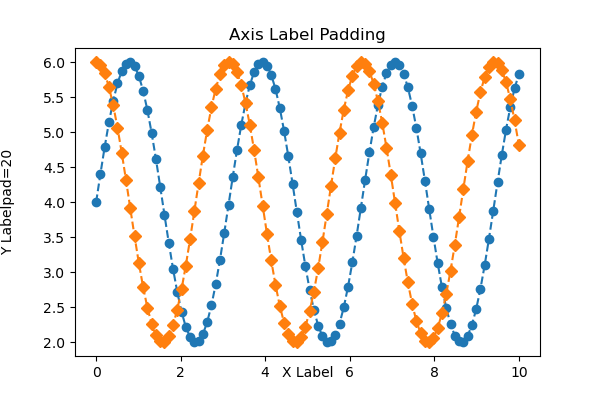
Labe position (loc)
Axis label positions are set to loc in Axes.set_xlabel and Axes.set_ylabel
X label : loc=(‘left’, ‘center’, ‘right’)
Y label : loc=(‘bottom’, ‘center’, ‘top’)
# step4 Set Axis
# Set axis labels
ax.set_xlabel('X Label', loc='left')
ax.set_ylabel('Y Label', loc='top')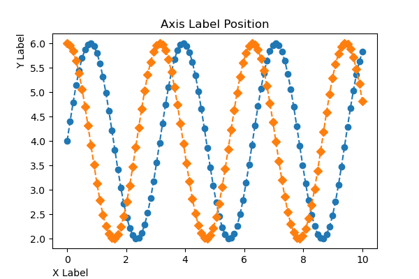
Appearance of axis label (Text)
Textproperties control the appearance of the label.
X label : Times New Roman, italic
Y label : Bold, size=16, red
# step4 Set AXis
# Set axis labels
ax.set_xlabel('X Label', fontfamily='Times New Roman', fontstyle='italic')
ax.set_ylabel('Y Label', fontweight='bold', fontsize=16, color='red') 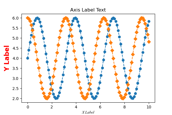
Axis Limit (Axes.set_xlim, set_ylim)
The upper and lower axis limits are set by Axes.set_xlim and Axes.set_ylim.
ax.set_xlim(0, 8), ax.set_ylim(0, 8)
- Parameters
-
- left, right or bottom, top (float) : Upper and lower limits for the coordinates of the graph. left can be specified only.
- auto (True or False) : Whether to turn on autoscaling of the x-axis. True turns on, False turns off, None leaves unchanged.
- xmin, xmax (float) : They are equivalent to left and right respectively, and it is an error to pass both xmin and left or xmax and right.
- Returns
-
- left, right or bottom, top
- Official Documentation
The following tabs explain with codes and flowcharts
# step0 Import libraries
import matplotlib.pyplot as plt
import numpy as np

# step1 Create data
x = np.linspace(0, 10, 100)
y1 = 4 + 2 * np.sin(2 * x)
y2 = 4 + 2 * np.cos(2 * x)

# step2 Create graphframes
fig, ax = plt.subplots(figsize=(6, 4))

# step3 Plot graph
ax.plot(x, y1, 'o--')
ax.plot(x, y2, 'D--')

# step4 Set axis
# Axis Label
ax.set_xlabel('X Label')
ax.set_ylabel('Y Label')

# Axis Limit
ax.set_xlim(0, 8)
ax.set_ylim(0, 8)

# Title
ax.set_title('Axis Limit')

# step5 Call the Figure
plt.show()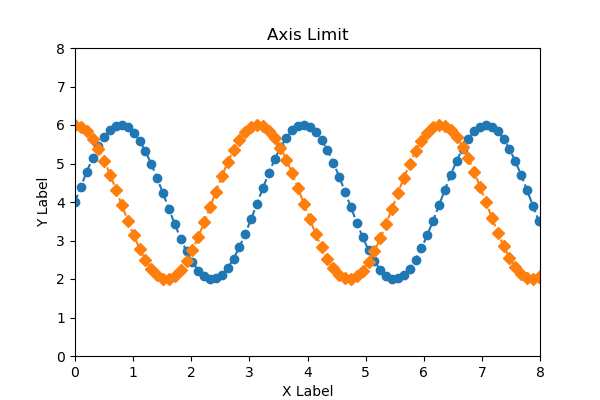
Only one side of the upper or lower limit
Axes.set_xlim specifies left, Axes.set_ylim specifies top only
ax.set_xlim(0), ax.set_ylim(None, 8)
# step4 Set Axis
# Axis Limit
ax.set_xlim(0)
ax.set_ylim(None, 8)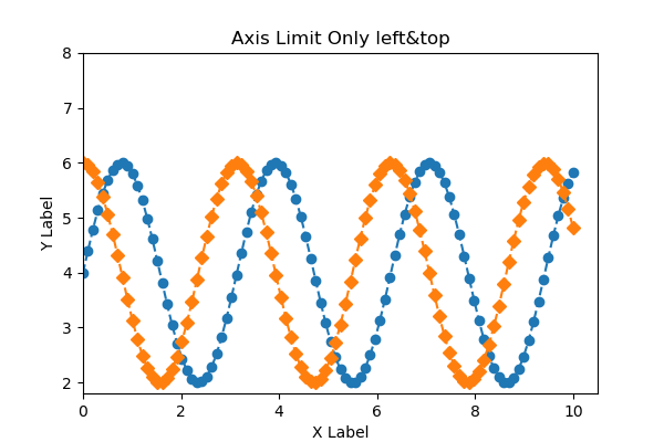
Reversing axis, Decreasing axis
A decreasing axis can be used by reversing the order of the axis limits.
ax.set_xlim(8, 0)
# step4 Set axis
# Axis Limit
ax.set_xlim(8, 0)
ax.set_ylim(0, 8)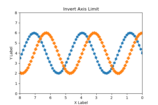
Axis Scale (Axes.xscale, yscale)
The axis scale can be set with Axes.set_xscale and Axes.set_yscale
ax.set_xscale('linear'), ax.set_yscale('log')
The following tabs explain with codes and flowcharts
# step0 Import libraries
import matplotlib.pyplot as plt
import numpy as np

# step1 Create data
x = np.linspace(0, 10, 100)
y1 = np.exp(1.2*x) + np.sin(2*x)
y2 = np.exp(x) + 2*np.cos(x)

# step2 Create graphframes
fig, ax = plt.subplots(figsize=(6, 4), constrained_layout=True)

# step3 Plot graph
ax.plot(x, y1)
ax.plot(x, y2)

# step4 Set axis labes and a title
ax.set_xlabel('linear')
ax.set_ylabel('linear')
ax.set_title('Axis Scale')

# step5 Set axis scale
# linear scale
ax.set_xscale('linear')
ax.set_yscale('linear')

# step6 Call the Figure
plt.show()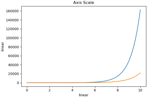
# step5 Set axis scale
ax.set_xscale('log')
ax.set_yscale('linear')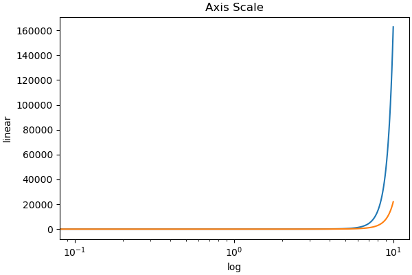
# step5 Set axis scale
ax.set_xscale('linear')
ax.set_yscale('log')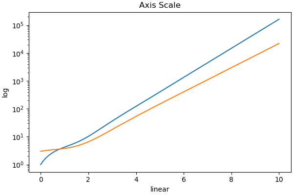
# step5 Set axis scale
ax.set_xscale('log')
ax.set_yscale('log')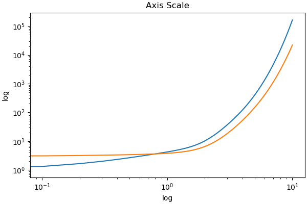
Axis Tick (Axes.set_xticks, Axes.set_yticks)
Scale position and string display are set with Axes.set_xticks, Axes.set_yticks
ax.set_xticks([0, 1, 2, 3, 4, 5, 6, 7, 8]), ax.set_yticks([0, 4, 8])
- Parameters
- Official Documentation
The following tabs explain with codes and flowcharts
# step0 Import libraries
import matplotlib.pyplot as plt
import numpy as np

# step1 Create data
x = np.linspace(0, 10, 100)
y1 = 4 + 2 * np.sin(2 * x)
y2 = 4 + 2 * np.cos(2 * x)

# step2 Create graphframes
fig, ax = plt.subplots(figsize=(6, 4))

# step3 Plot graph
ax.plot(x, y1, 'o--')
ax.plot(x, y2, 'D--')

# step4 Set axis
# Axis Labels
ax.set_xlabel('X Label')
ax.set_ylabel('Y Label')
# Axis Limits
ax.set_xlim(0, 8)
ax.set_ylim(0, 8)

# Axis ticks
ax.set_xticks([0, 1, 2, 3, 4, 5, 6, 7, 8])
ax.set_yticks([0, 4, 8])
ax.set_title('Axis Ticks')

# step5 Call the Figure
plt.show()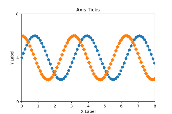
String ticks (labels)
labels turns the ticks into strings
The position of the string is determined by the ticks used earlier
# step4 Set axis
# Axis ticks
ax.set_xticks(
    [0, 1, 2, 3, 4, 5, 6, 7, 8],
    labels=['a', 'b', 'c', 'e', 'f', 'g','h', 'i', 'j']
)
ax.set_yticks([0, 4, 8])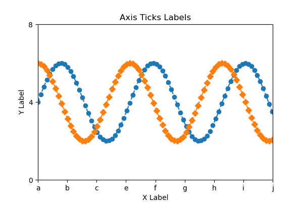
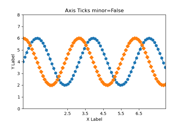
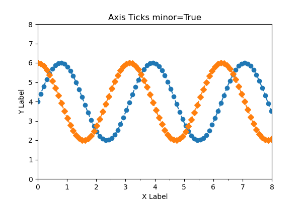
Minor scales (minor)
Axes.set_xticks specifies major ticks by default, and minor ticks can be specified with minor=True
Comparison was made between major and minor ticks when the following values were specified
ax.set_xticks([2.5, 3.5, 4.5, 5.5, 6.5])
# step4 Set axis
# Axis ticks
ax.set_xticks([2.5, 3.5, 4.5, 5.5, 6.5])
Major scalesminor=False
Minor scalesminor=True
Custom Scales (Axes.tick_params)
Axes.tick_params changes the appearance of ticks, tick labels, and grid lines.
- Parameters
-
- axis (‘x’, ‘y’ or ‘both’) : The axis to which the parameters are applied.
- which (‘major’, ‘minor’, ‘both’) : The group of ticks to which the parameters are applied.
- reset (True or False) : Whether to reset the ticks to defaults before updating them.
- Official Documentation
Only a few customizations are presented in this article
x-axis : color and direction of scale, width
y-axis : label color and size
# step4 Set axis
# x-axis : color and direction of scale, width
ax.tick_params('x', color='red', direction='in', width=5)
# y-axis : label color and size
ax.tick_params('y', labelcolor='red', labelsize=16)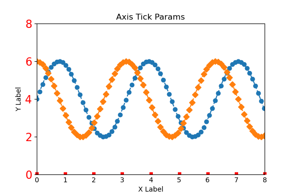
Add or Delete axis
How to add and remove axes is explained.
The Python code for step 1 data creation and step 2 graph frame creation is the same as in the previous chapters.
Add Axis (Axes.twinx)
To increase the number of axes in Matplotlib, use the Axes.twinx function (or twiny)
twin1 = ax.twinx()
- Returns
-
Axes
- Official Documentation
# step3 Create y-axis
twin1 = ax.twinx()

# step4 Plot graphs
ax.plot(x, y1, color='C0')
twin1.plot(x, y2, color='C1')

# step4 Set axis
# Axis Label
ax.set_xlabel('X label')
ax.set_ylabel('Y1')
twin1.set_ylabel('Y2')
# Axis Color
ax.tick_params(axis='y', colors='C0')
twin1.tick_params(axis='y', colors='C1')

ax.set_title('Twin Axis Ticks')

# step5 Call the Figure
plt.show()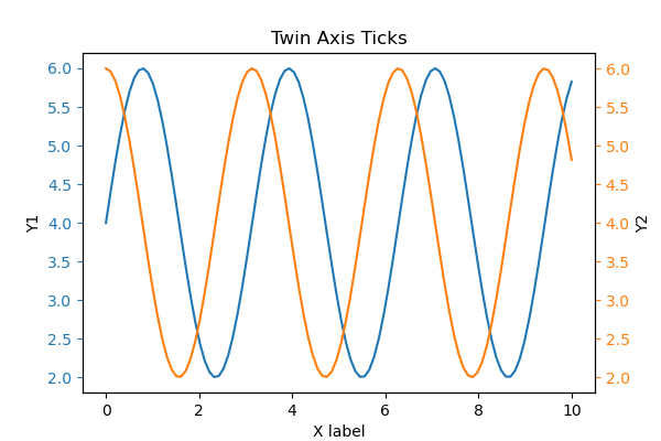
Delete frame
The frame of the graph uses spines
Specify the box to hide from top, right, left, bottomax.spines[['top', 'right']].set_visible(False)
- Parent Class
-
Patch : 2D Artist with face color and edge color
- Official Documentation
# step3 Plot graphs
ax.plot(x, y1, 'o--')
ax.plot(x, y2, 'D--')

# step4 Set axis
# Delete frame
ax.spines[['top', 'right']].set_visible(False)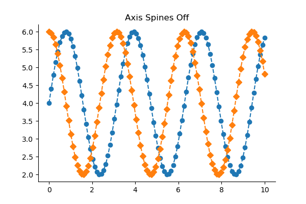
Delete Scale
Axis class is used for graph scales
ax.yaxis.set_visible(False)
- Parameters
- Parent Class
-
- matplotlib.axis.Axis : Axis object
- Official Documentation
# step3 Plot graphs
ax.plot(x, y1, 'o--')
ax.plot(x, y2, 'D--')

# step4 Set axis
# Delete y-axis scale
ax.yaxis.set_visible(False)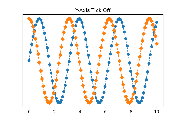
Delete y-axis scale and frame
Delete the y-axis completely by combining the Delete frame and the Delete scale
Delete frame : ax.spines[['top', 'right', 'left']].set_visible(False)
Delete scale : ax.yaxis.set_visible(False)
# step3 Plot graphs
ax.plot(x, y1, 'o--')
ax.plot(x, y2, 'D--')

# step4 Set axis
# Delete scale
ax.yaxis.set_visible(False)
# Delete frame
ax.spines[['top', 'right', 'left']].set_visible(False)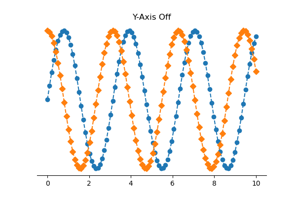
Delete all scales and frames at once
Axes.set_axis_off() removes everything related to the x and y axes.
# step3 Plot graphs
ax.plot(x, y1, 'o--')
ax.plot(x, y2, 'D--')

# step4 Set axis
# Delete all axis
ax.set_axis_off()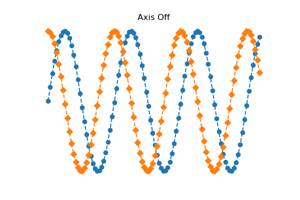
References
Axis Label Position
Plots with different scales
Invert Axes


Comments