Have you ever plotted a frequency distribution chart using a histogram, but found it difficult to understand or not visually appealing?
In such cases, using a stem plot (trunk diagram) makes it easier to understand the frequencies and baselines.
Not only frequency distributions, but also discrete data can be plotted on a stem plot.
This article explains how to plot stem plots in Matplotlib in Python and how to customize them.
Stem plot options
Stem plots in Matplotlib are drawn with the Axes.stem function.
- Parameters
-
- locs (array-like) : For vertical stem plots, the x-positions of the stems. For horizontal stem plots, the y-positions of the stems.
- heads (array-like) : For vertical stem plots, the y-values of the stem heads. For horizontal stem plots, the x-values of the stem heads.
- linefmt (str) : A string defining the color and/or linestyle of the vertical lines
- markerfmt (str) : A string defining the color and/or shape of the markers at the stem heads.
- basefmt (str) : A format string defining the properties of the baseline.
- label (str) : The label to use for the stems in legends.
- bottom (float) : The y/x-position of the baseline (depending on orientation).
- orientation (str) : If ‘vertical’, will produce a plot with stems oriented vertically, If ‘horizontal’, the stems will be oriented horizontally.
- Returns
- Offcial Documentation
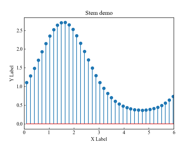
Basic Stem Plot (locs, heads)
The code specifies the x and y values of the Axes.stem function as one-dimensional arrays, in the same way as for a line chart
The following tabs explain the code and flowchart
# step0 Import libraries
import matplotlib.pyplot as plt
import numpy as np


# step1 Create data
x = np.linspace(0.1, 2 * np.pi, 41)
y = np.exp(np.sin(x))

# step2 Create graph frames
fig, ax = plt.subplots()

# step3 Plot a stem plot
ax.stem(x, y)

# step4 Set axis labels, xlimit and a title
ax.set_xlabel('X Label')
ax.set_ylabel('Y Label')
ax.set_xlim(0, 6)
ax.set_title('Stem demo')

# step5 Call the Figure
plt.show()Custom Formats (linefmt, markerfmt, basefmt)
Stem plot has three major components, allowing you to change the color, line style, and marker type.
fmt is a format string that specifies marker, line color, and line type at once.
or--: o=circle,r=red,--=dashed
- Stem (linefmt) : Line from root to tip of stem
- Heads (markerfmt) : point at the end of the trunk, y-coordinate
- Baseline (basefmt) : Baseline of the root from which the stem grows
Stem (linefmt)
linefmt customizes the line style and color on the stem line.ax.stem(x, y, linefmt='--')
Line styles that can be specified include the following'-' : solid'--' : dashed'-.' : dashdot':' : dotted
The following tabs explain the code and flowchart.
# step1 Crate data
x = np.linspace(0.1, 2 * np.pi, 41)
y = np.exp(np.sin(x))

# step2 Create graph frames
fig, ax = plt.subplots()

# step3 Plot a stem plot
ax.stem(x, y, linefmt='--')

# step4 Set axis labels and title
ax.set_xlabel('X Label')
ax.set_ylabel('Y Label')
ax.set_title('Stem LineFmt')

# step5 Call the Figure
plt.show()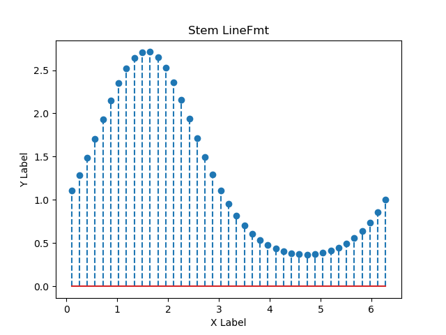
Use the format string to specify the color and style of the stem line at the same time.linefmt='g:':g=green,:=dotted
# step3 Plot a stem plot
ax.stem(x, y, linefmt='g:')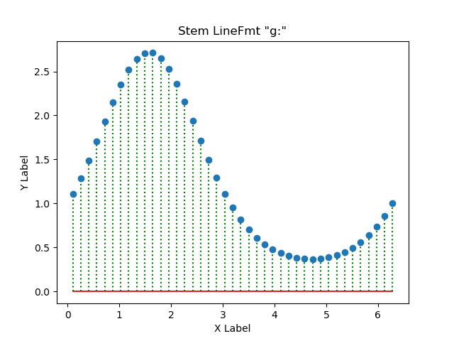
Heads (markerfmt)
markerfmt customizes the marker at the end of the stem.ax.stem(x, y, markerfmt='^')
There is quite a variety of markers available. Please refer to the links below for more information
# step3 Plot a stem plot
ax.stem(x, y, markerfmt='^')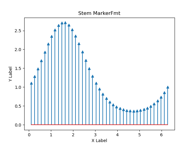
Specify the color and shape of the stem marker simultaneously using the format stringmarkerfmt='r*':r=red,*=star
# step3 Plot a stem plot
ax.stem(x, y, markerfmt='r*')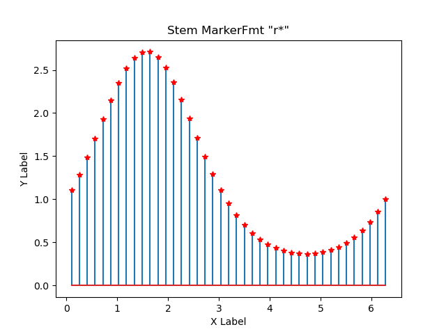
Baseline (basefmt)
basefmt customizes the baseline of the root of the stem.ax.stem(x, y, basefmt='green')
# step3 Plot a stem plot
ax.stem(x, y, basefmt='green')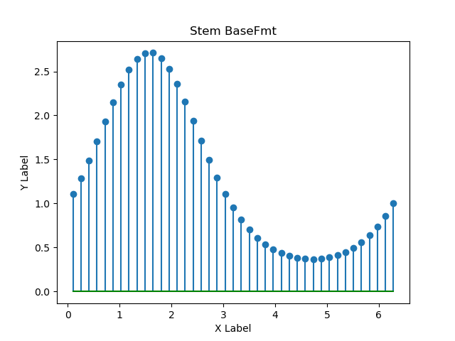
Specify the baseline color, marker, and line style of the trunk at the same time using the format stringbasefmt='m-.D':m=magenta,-.=dashdot,D=diamond
# step3 Plot a stem plot
ax.stem(x, y, basefmt='m-.D')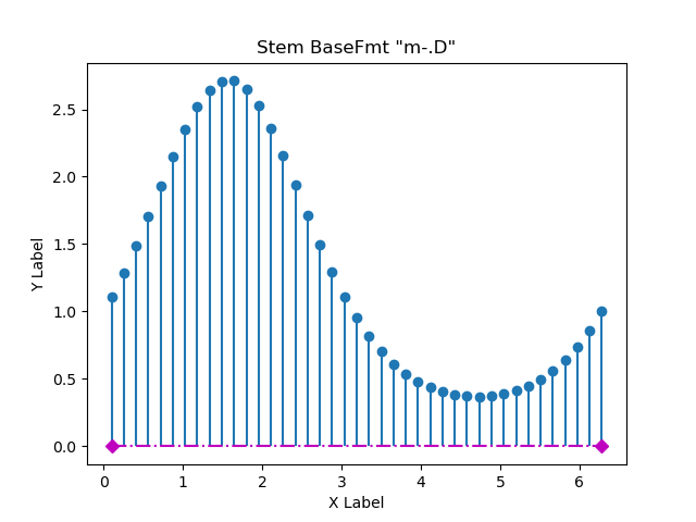
Legend labels and baselines (label, bottom, orientation)
label: Specifies the string label in the legend
The label was specified with examples of bottom and orientation, and a legend was displayed.
Baseline Position (bottom)
Baseline position can be specified numericallybottom=1: y=1
# step3 Plot a stem plot
ax.stem(x, y, bottom=1, label='bottom=1')

# step4 Set axis labels and title
ax.legend()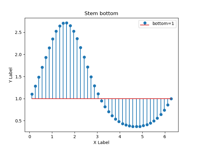
Baseline Directions (orientation)
The stem plot can also change the position of the stem growth on the y-axis.
- Vertical:
orientation='vertical', default - Horizontality:
orientation='horizontal'
# step3 Plot a stem plot
ax.stem(x, y, orientation='horizontal', label='horizontal')

# step4 Set axis label and title
ax.legend()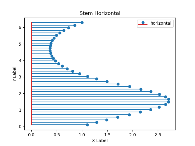
References
Official Stem plot Documentation
Official documentation of Axes.stem
Comments