As you plot a graph for the first time, you are anxious about how to get started. You may be lost, unable to understand the structure and elements of a graph.
This article provides a detailed explanation of how to plot graphs using Matplotlib in Python from scratch.
The focus is on understanding the composition and elements of a graph, so even beginners can get started without hesitation.
After reading this book, you will definitely be able to acquire basic skills in drawing graphs utilizing Matplotlib and gradually take on the challenge of visualizing complex data.
Before plotting a graph
Drawing Graphs in Python Requires a Library
In this article, we will use Matplotlib, the most common library for graphs.
The installation procedure differs depending on whether you are using the general Python environment or the Anaconda environment, and is explained in detail below.
General Python Environment

If built from the installer from the official Python website below, it is a general Python environment.
This is the purest Python environment, so install Matplotlib at the command prompt.
pip install matplotlibWhen the installation starts, enter y at the yes or no selection. After installation, you can check either pip list or pip freeze.
pip list

# matplotlib                    3.5.2
# matplotlib-inline             0.1.6
Anaconda Environment

If conducted from the following site, the Anaconda environment will be used.
Even if you have forgotten it, search for the apps installed on your PC using ANACONDA. You should be able to find some apps.
If you are in an Anaconda environment, Matplotlib is installed by default; start Anaconda Prompt and check it in the conda list.
conda list

# matplotlib                3.5.2            py39haa95532_0
# matplotlib-base           3.5.2            py39hd77b12b_0
# matplotlib-inline         0.1.6            py39haa95532_0
If Matplotlib is not installed, use conda install.
conda install -c conda-forge matplotlib
A Simple Graph
Create simple line graphs using Matplotlib.
The following tabs explain with codes and flowcharts.
# step1 Import a library
import matplotlib.pyplot as plt

# step2 Create a Figure containing Axes
fig, ax = plt.subplots()

# step3 Plot data on Axes
ax.plot([1, 2, 3, 4, 5], [1, 4, 2, 5, 7])

# step4 Call the Figure
plt.show()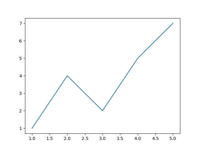

Components of a Figure
The following is a summary of the components of a Matplotlib diagram.
Components of a Figure
- The whole figure (Figure)
-
All child Axes, titles, figure legends, color bars, etc. are supported.
Although it is convenient to write the graph in combination with Axes, it is also possible to draw the graph with Figure alone.
- A region for plotting data (Axes)
-
Artist in the Figure that contains the plot area of the data.
It usually contains two (three in the case of 3D)
Axisobjects (note the difference betweenAxesandAxis) and provides tick and tick labels in the Axes. Each Axes also has a title, x label, and y label. - Figure Axis Setting (Axis)
-
Objects related to the axes of the figure.
Sets the scale and limits, and generates ticks and tick labels. The position of the scale is determined by the
Locatorobject and the string of the scale label is formatted by theFormatter. - All elements in the figure (Artist)
-
Basically, anything visible on a Figure is an Artist (including
Figure,AxesandAxisobjects).When Figure is invoked, all Artists are drawn.

Types of inputs
The input for a graph is basically a list or a tuple, since an array can be used for input.
The following objects are assumed as input to the graph.
- numpy.array
- numpy.ma.masked_array
- numpy.asarray
Coding styles
There are basically two ways to plot a graph using Matplotlib.
- Figure+Axes (OO-style)
-
Creates Figures and Axes and calls them.
Basic style, recommended for complex plots and large projects.
- Only Figure (pyplot-style)
-
Create a Figure and Axes and call only the Figure using the pyplot function.
This pyplot style is very useful for quick interactive work.
Figure+Axes (OO-style)
The explicit “Axes” interface creates other Artists using the methods of the Figure or Axes object to build the visualization step by step.
This is called “object-oriented”=OO-style.
Each object is explicitly referenced, making it very flexible and allowing for customization after the object is created and before it is displayed.
General style, recommended for complex plots and large projects.
# step1 Import libraries
import matplotlib.pyplot as plt
import numpy as np


# step2 Create data
x = np.arange(8)
apples = [5, 12, 8, 15, 20, 10, 18, 7]
oranges = [3, 14, 9, 17, 22, 11, 16, 6]
grapes = [8, 18, 12, 20, 25, 15, 23, 9]

# step3 Create graph frames
fig, ax = plt.subplots(figsize=(6, 4))

# step4 Plot graphs
ax.plot(x, apples, label='apples')
ax.plot(x, oranges, label='oranges')
ax.plot(x, grapes, label='grapes')

# step5 Set axis labels, a title and a legend
ax.set_xlabel('X label') # X label
ax.set_ylabel('Y label') # Y label
ax.set_title('Figure+Axes OO-style')  # Title
ax.legend()  # Legend

# step6 Call the Figure
plt.show()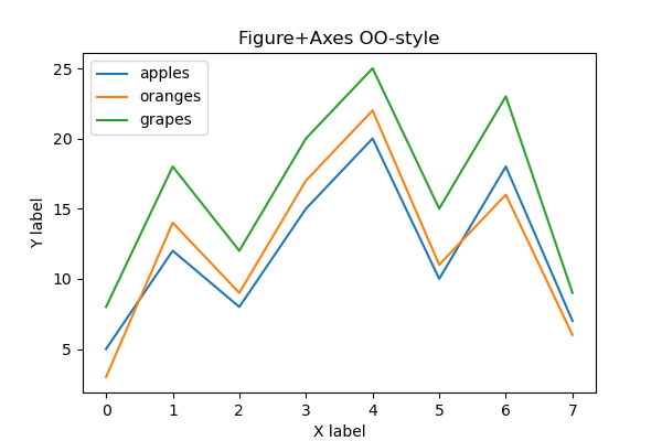
Only Figure (pyplot-style)
The implicit “pyplot” interface keeps track of the last created Figures and Axes and adds Artist to the object the user wants.
The code is simple and easy to understand, and graphs can be plotted quickly.
However, it is less flexible because it always tracks the last Figure, and if there are multiple Figures, it must be recalled and an Artist must be added.
# step1 Import libraries
import matplotlib.pyplot as plt
import numpy as np


# step2 Create data
x = np.arange(8)
apples = [5, 12, 8, 15, 20, 10, 18, 7]
oranges = [3, 14, 9, 17, 22, 11, 16, 6]
grapes = [8, 18, 12, 20, 25, 15, 23, 9]

# step3 Create a graph frame
plt.figure(figsize=(6, 4))

# step4 Plot graphs
plt.plot(x, apples, label='apples')
plt.plot(x, oranges, label='oranges')
plt.plot(x, grapes, label='grapes')

# step5 Set Axis labels, a title and a legend
plt.xlabel('X label') # X label
plt.ylabel('Y label') # Y label
plt.title('Only Figure pyplot-style')  # Title
plt.legend()  # legend

# step6 Call the Figure
plt.show()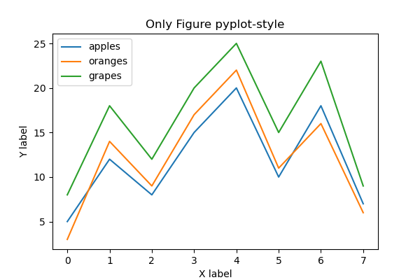
Styling of graphs
Styling can be added (1) when calling Axes.plot or (2) later using “setter” in Artist. The method (1) is recommended, and (2) needs to be replaced with a variable.
Three types of styling are performed: color, line thickness, and line type.
The code used OO-style.
# step3 Plot a graph

# 1 when calling Axes.plot
ax.plot(x, apples, label='apples', color='red', linewidth=3, linestyle='--')

# 2 later using "setter" in Artist
o, = ax.plot(x, oranges, label='oranges', color='#F44336')
o.set_linewidth(2)
o.set_linestyle('-.')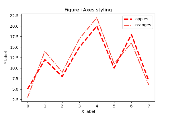
Multiple Graphs
Multiple graphs can be placed in one window using the matrix method.
The number of items is specified in parentheses in the order of rows and columns, as in plt.subplots(rows, columns).
Each call to Axes should be made as axs[0] or axs[1], as in the case of lists.
# step2 Create graph frames
fig, axs = plt.subplots(2, 1, figsize=(6, 4))

# step3 Plot graphs
axs[0].plot(x, apples, label='apples', color='r')
axs[1].plot(x, oranges, label='oranges', color='C1')

# step4 Set axis labels, a title and a legend
axs[0].set_xlabel('X label') # X label
axs[0].set_ylabel('Y label') # Y label
axs[0].legend()  # legend
fig.suptitle('Multiple Figures and Axes') 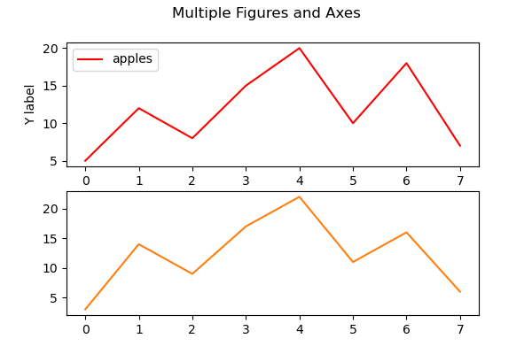

Set axis scales and ticks
Each Axes has two Axis objects representing the X and Y axes. These control the scale, tick position, and tick style of the axis.
The upper and lower limits of the scale, the tick width of the scale, and the logarithmic scale are set.
The code is written in the same way as for axis labels and titles.
# step0 Import libraries
import matplotlib.pyplot as plt
import numpy as np

# step1 Create data
x = np.linspace(0, 10, 100)
y1 = np.exp(x) + 2 * np.sin(2 * x)
y2 = np.exp(x) + 2 * np.cos(2 * x)

# step2 Create graph frames
fig, axs = plt.subplots(1, 2, sharex=True)

# step3 Plot graphs
for ax in axs.flat:
    ax.plot(x, y1, label='Sample 1')
    ax.plot(x, y2, label='Sample 2')
    ax.legend()

# step4 Set axis labels and a title
axs[0].set_title('linear')
axs[1].set_title('log')

fig.suptitle('scale')
fig.supxlabel('X label')
fig.supylabel('Y label')

# step5 Set axis scales and ticks
axs[0].set_xlim(0, 10)
axs[0].set_ylim(0)
axs[0].set_yticks([0, 6000, 12000, 18000, 24000])
axs[1].set_yscale('log')

# step6 Call the figure
plt.show()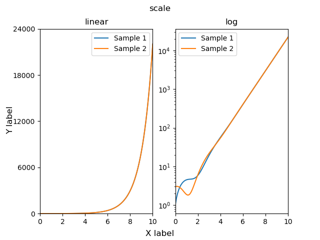
References
Quick start guide


Comments