\ 迷ったらまずTechAcademyの無料カウンセリング! /
【Matplotlib】箱ひげ図を徹底解説!平均値,中央値,外れ値の表示 (boxplot)

データの傾向やばらつきを一目で把握したいけれど,箱ひげ図の描画方法や要素の表示方法が分からなくて戸惑っているかもしれません。
この記事ではMatplotlibのboxplot関数を通じて,箱ひげ図やその平均・中央値・外れ値の表示方法を丁寧に解説します。データの特徴を的確に理解するためのスキルを獲得しましょう。
読み終えた後,Matplotlibのboxplotを用いて,データセットの傾向とばらつきを効果的に視覚化できるようになります
箱ひげ図にデータ分布を追加したバイオリン図に関しては下記記事を参考にしてください
あわせて読みたい

【Matplotlib】バイオリン図の魅力!平均値,中央値,極限領域,色 (violinplot)
データの分布や特性を的確に理解し,極限領域や中央値を視覚的に捉えたいと思っているかもしれませんが,バイオリン図(violinplot)の使い方やそれが示すデータの意味…
目次
Axes.boxplot関数の引数一覧
箱ひげ図はAxes.boxplot関数の引数に配列を渡すことで描画できます
Axes.boxplot
- 引数
-
- x (配列):データ.1次元配列で1つ,2次元配列で複数
- notch (bool) : ノッチ付き箱ひげ図 (True),長方形箱ひげ図 (False) のどちらを描くか指定.ノッチは,中央値付近の信頼区間(CI)を表す
- sym (文字列) : 外れ値の記号.空文字を指定すると外れ値が非表示になる
- whis (float) : ひげの位置
- positions (配列):箱のx座標の位置
- vert (bool):箱の方向.垂直方向はTrue,水平方向はFalse
- widths (float, 配列):箱の幅.1つの値か1次元配列のどちらかを指定
- patch_artist (bool) : False の場合,Line2Dで箱が描画される.それ以外は,Patchアーティストで描画される
- showmeans (bool):平均値.デフォルトはFalse
- meanline (bool) : 平均値を線で表示
- medianprops (dict) : 中央値のカスタマイズ
- meanprops (dict) : 平均値のカスタマイズ
- 返値
-
dict
boxplot関数の各要素に対応した辞書
- 公式ドキュメント
一般的な箱ひげ図
1次元配列を渡すと,箱ひげ図が1つできます
2次元配列を渡すと,箱ひげ図が要素数分できます
下記のタブにコードとフローチャートの解説をしています
import matplotlib.pyplot as plt
import numpy as np

# step1 発生する乱数の固定化
np.random.seed(19680801)
# step2 データの作成
all_data = [np.random.normal(0, std, 100) for std in range(7, 10)]
labels = ['x1', 'x2', 'x3']
# step3 グラフフレームの作成
fig, ax = plt.subplots()

# step4 箱ひげ図の描画
# 一般的な箱ひげ図
ax.boxplot(all_data, labels=labels)
ax.set_title('basic plot')

ax.set_xlabel('X label')
ax.set_ylabel('Y label')

plt.show()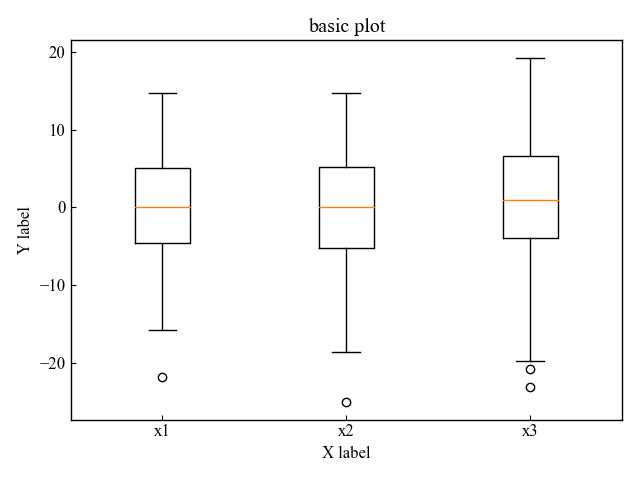
ノッチ付きの箱ひげ図 (notch)
箱ひげ図の箱に切り欠きがあるノッチ付き箱ひげ図を表示します
ノッチは中央値付近の信頼区間(CI)を表します
Axes.boxplot関数の第2引数のnotchに,1もしくはTrueを入力します
# step4 箱ひげ図の描画
# ノッチ付き
ax.boxplot(all_data, 1, labels=labels)

plt.show()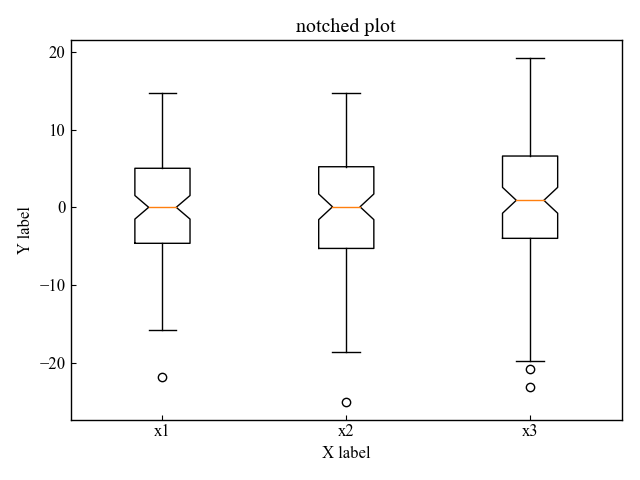
外れ値 (sym, whis)
箱ひげ図には外れ値が表示されます
その外れ値は色や記号をカスタマイズすることが可能で,表示しないこともできます
外れ値の記号の色と形をカスタマイズする (sym=’gD’)
箱ひげ図の外れ値の記号をカスタマイズします
Axes.boxplot関数の第3引数のsymに,文字列を入力します
# step4 箱ひげ図の描画
# 外れ値の記号
ax.boxplot(all_data, sym='gD', labels=labels)

plt.show()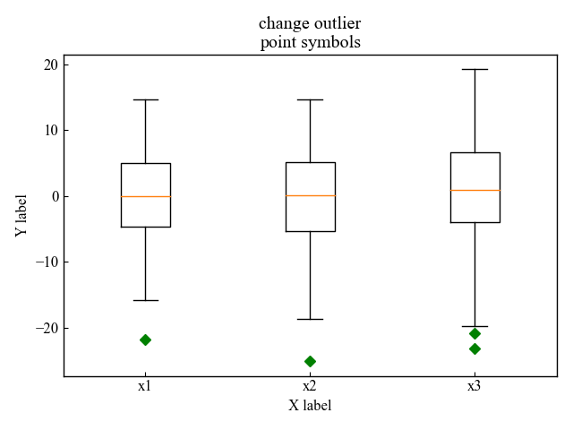
外れ値を表示しない (sym=’空文字’)
箱ひげ図の外れ値の点を表示しないようにします
Axes.boxplot関数の第3引数のsymに,空文字を渡します
# step4 箱ひげ図の描画
# 外れ値の表示有無
ax.boxplot(all_data, sym='', labels=labels)

plt.show()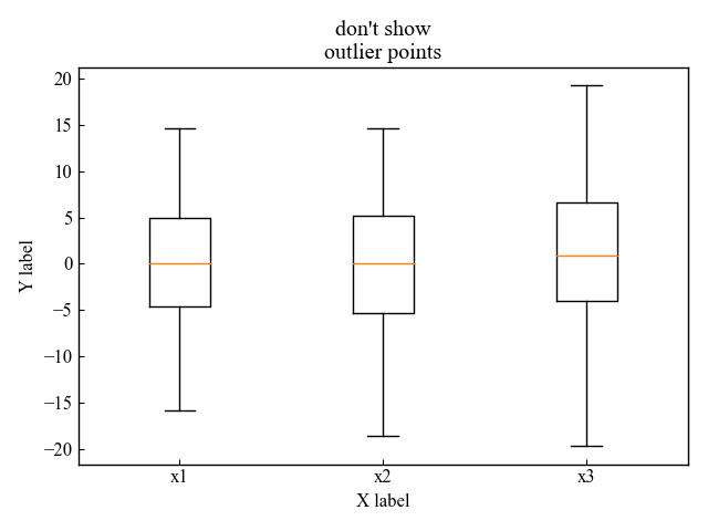
外れ値を範囲を設定する (whis)
箱ひげ図の長さを調整して,外れ値の範囲を設定します
Axes.boxplot関数の第5引数のwhisに,数字を入力します
デフォルトでは1.5が指定されています
# step4 箱ひげ図の描画
# 髭の長さを調整して,外れ値の領域を変える
ax.boxplot(all_data, sym='rs', whis=0.75, labels=labels)

plt.show()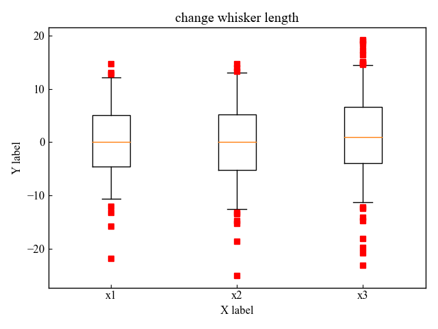
水平方向の箱ひげ図 (vert)
箱ひげ図を水平方向に表示します
Axes.boxplot関数の第4引数のvertに,0もしくはFalseを入力します
# step4 箱ひげ図の描画
# 水平箱ひげ図
ax.boxplot(all_data, sym='rs', vert=False, labels=labels)

plt.show()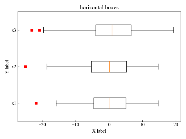
箱と枠の色 (patch_artist)
箱ひげ図の箱の色をおしゃれにカスタマイズします
Axes.boxplot関数の引数に,patch_artist=Trueとし,変数(bplot)に置き換えてください
箱全体の色を変える (set_color, set_facecolor)
箱ひげ図の属性の[‘boxes’]にset_colorもしくはset_facecolorで色を割り当てられます
colorとfacecolorの違い
- set_color : 箱全体.枠も含まれる
- set_facecolor : 箱の中.枠は含まれない
# step4 箱ひげ図の描画
# 箱の色
bplot = ax.boxplot(all_data, labels=labels, patch_artist=True)
# 色のリスト
colors = ['pink', 'lightblue', 'lightgreen']
# 色を各箱に割り当て
for patch, color in zip(bplot['boxes'], colors):
    patch.set_color(color)

plt.show()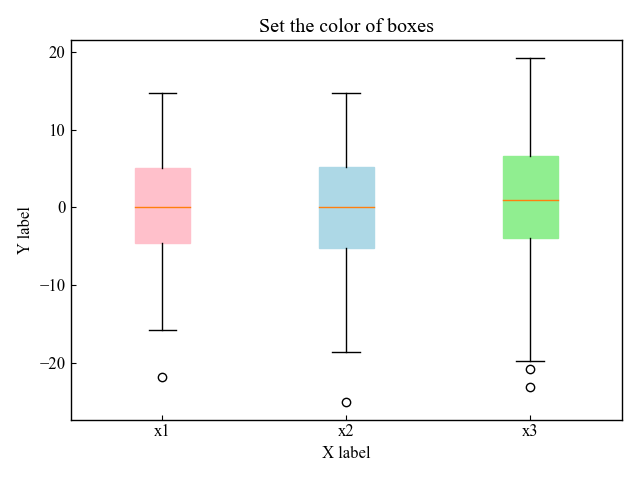
# step4 箱ひげ図の描画
# 箱の色
bplot = ax.boxplot(all_data, labels=labels, patch_artist=True)
# 色のリスト
colors = ['pink', 'lightblue', 'lightgreen']
# 色を各箱に割り当て
for patch, color in zip(bplot['boxes'], colors):
    patch.set_facecolor(color)

plt.show()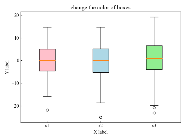
箱の枠をカスタマイズする (edgecolor, linewidth)
箱ひげ図の属性の[‘boxes’]にset_edgecolorで枠の色,set_linewidthで枠の太さを割り当てられます
# step4 箱ひげ図の描画
# 箱の色
bplot = ax.boxplot(all_data, labels=labels, patch_artist=True)
# 色のリスト
colors = ['pink', 'lightblue', 'lightgreen']
# 色を各箱に割り当て
for patch, color in zip(bplot['boxes'], colors):
    # 箱の色
    patch.set_color('white')
    # 枠の色
    patch.set_edgecolor(color)
    # 枠の太さ
    patch.set_linewidth(3)

plt.show()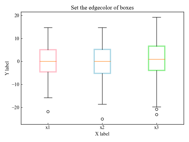
平均値 (showmeans, meanline)
Matplotlibの箱ひげ図は中央値がデフォルトで表示されるようになっていますが,平均値も表示できます
記号と線で表示する2通りあるため,それぞれ解説します
記号で平均値 (showmeans)
Axes.boxplot関数の引数showmeansに,Trueと入力します
# step4 箱ひげ図の描画
# 平均値
ax.boxplot(all_data, labels=labels, showmeans=True)

plt.show()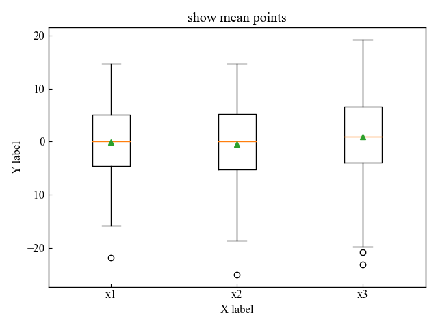
線で平均値 (meanline)
Axes.boxplot関数の引数showmeansに加えてmeanlineに,Trueと入力します
# step4 箱ひげ図の描画
# 平均値
ax.boxplot(all_data, labels=labels, showmeans=True, meanline=True)

plt.show()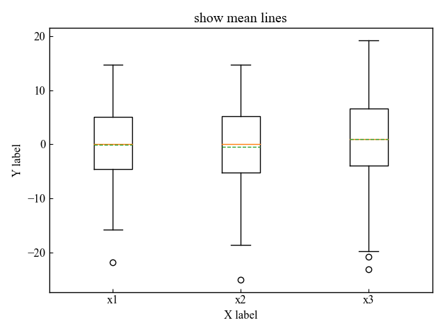
中央値と平均値のカスタマイズ (medianprops, meanprops)
箱ひげ図の中央値と平均値を自由にいじっていきましょう
medianprops, meanpropsに辞書型で各パラメータを設定していきます
中央値の色と線スタイル (medianprops)
Axes.boxplot関数の引数medianpropsに辞書を入力します
medianpropsで指定した項目
- color : 線の色
- linewidth : 線の太さ
- linestyle : 線のスタイル.–, —, -., : などがある
# step4 箱ひげ図の描画
# 中央値
ax.boxplot(
    all_data,
    labels=labels,
    medianprops={
        # 色
        'color': 'C0',
        # 線の太さ
        'linewidth':3,
        # 線の種類
        'linestyle': '-.',
    }
)

plt.show()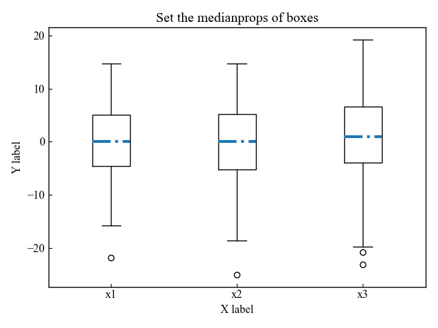
平均値の色と線スタイル (meanprops)
Axes.boxplot関数の引数meanpropsに辞書を入力します
また,中央値は非表示にしました
meanpropsで指定した項目
- marker : マーカーの形状
- markersize : マーカーサイズ
- markerfacecolor : マーカーの表面の色.文字列で指定
- markeredgecolor : マーカーの枠の色.RGBで指定
- markeredgewidth : マーカーの枠の太さ
# step4 箱ひげ図の描画
# 平均値
ax.boxplot(all_data, labels=labels, showmeans=True,
            # 中央値非表示
            medianprops={
                'visible': False
            },
            # 平均値のカスタマイズ
            meanprops={
                'marker': 'v',
                'markersize': 7,
                'markerfacecolor': 'white',
                'markeredgecolor': '#0097a7',
                'markeredgewidth': 2,
            }
)

plt.show()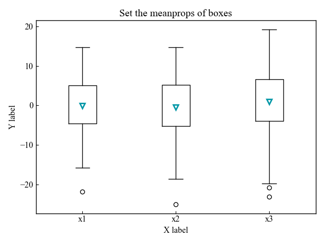
参考文献
箱ひげ図のデモ
箱ひげ図の色の設定
お疲れ様でした